
The Complete Guide to Utility Photo Data Quality
Most utilities already own the photos they would need to predict failures. What they lack is photo data that can carry a prediction. Here is what decision-grade photo data means, why prediction breaks without it, and the standard to write into your next inspection contract.
- About 40% of utility inspection imagery is rejected or unusable somewhere in the pipeline, and roughly 48% of infrastructure rework traces back to bad inspection data rather than bad fieldwork (Detect Data Quality Program, 2026).
- Failure prediction from photos breaks for five reasons, and none of them is the model: unusable capture, misassociation, no cycle-to-cycle continuity, taxonomy drift, and a 3-6 month lag between capture and action.
- Capture quality sets a hard ceiling. Sharp imagery keeps 100% of a 258-type defect catalog assessable; soft capture 69%; blurry capture 7%.
- The Decision-Grade Photo Standard is five clauses for the inspection contract: coverage, resolution, association, continuity, acceptance. Write them in before the first flight.
- Clean records make risk visible. On one 345kV construction program, 76% of critical defects sat on a single segment - a pattern only a consistent, structure-linked record could reveal.
Every utility inspection program produces the same artifact: tens of thousands of photographs. Two programs can hold the same pictures and get opposite results. In one, an analyst finds a backed-off clevis bolt in the line's first operating season. In the other, the same image sits in a folder named after the flight date until the winter storm answers the question for everyone. The difference is not the camera or the model. It is whether the photo is data.
- What utility photo data quality means
- Why it is hard to predict failures from photos
- The three records prediction needs
- The Decision-Grade Photo Standard
- Inside the Data Quality Program
- What good photo data changes in the field
- How to measure photo data quality
- How to start
- Frequently asked questions
What is utility photo data quality?
Utility photo data quality is the degree to which an inspection image can do three jobs. Show a component well enough to judge its condition. Attach to the exact structure it depicts. Line up with the same view from the last cycle. An image that does all three is evidence. An image that does none is a picture.
The distinction matters because utility asset inspection has become an imagery business. Drone, helicopter, truck, and phone capture now produce more frames in a season than any crew could review by hand. Every one of them is a candidate input for visual data analysis, computer vision, and the failure models built on top. The models are only as good as what they are fed - and the feed is where most programs quietly lose.
Those three figures are printed in Detect's Data Quality Program asset-owner report, and they describe the same problem from three angles. A large share of paid-for imagery never becomes usable evidence. When crews go back out, the cause is usually the data, not the crew. And the time it takes to turn a capture into an action is long enough for the asset's condition to change underneath the answer.
What makes it hard for utilities to predict failures from asset photos?
Five things, and the model is not one of them. Predictive maintenance for utility grid assets fails on photo data long before any algorithm runs, for reasons that are settled in the field and in the contract:
1. The unusable share. About 40% of inspection imagery is rejected or unusable somewhere in the pipeline (Detect Data Quality Program, 2026). A model cannot learn a trend from a data point that does not exist - a blurry frame does not degrade a forecast, it deletes the observation.
2. Misassociation. Across the contracts analyzed in Detect's State of Utility Drone Inspections 2026, GPS misassociation - imagery tagged to the wrong structure - drove 35% of delivered-imagery rework. A perfect photo of the wrong pole poisons two condition records at once.
3. No continuity. Prediction is a comparison. If cycle two was flown from different positions than cycle one, the record cannot say whether a crack grew or the camera moved. Missing component coverage alone accounts for 30% of rework (same report).
4. Taxonomy drift. One contractor logs "corrosion," another "rust," a third "surface oxidation - minor." Three seasons later the asset has three histories, none of which trend.
5. Lag. The typical 3-6 months between capture and action is longer than a storm season. By the time the finding reaches a planner, the condition it describes may already be an outage.
Roughly 48% of infrastructure rework traces back to bad inspection data, not bad fieldwork. The crews did their jobs. The photos could not carry the decision. Every dollar of that rework is a dollar that never reached a forecast.
Source: Detect Data Quality Program, asset-owner report, 2026.
Notice what is missing from the list: model accuracy. It matters, but it is the last constraint, not the first. A better model fed the same 40% unusable share simply finds nothing faster. That is why every program that reaches genuine asset failure prediction starts by fixing the inputs.
What does decision-grade photo data look like?
It looks like three records that agree with each other: an image record that can be assessed, a location record that is verified, and an asset record that stays continuous across cycles. Miss one and the other two lose most of their value.
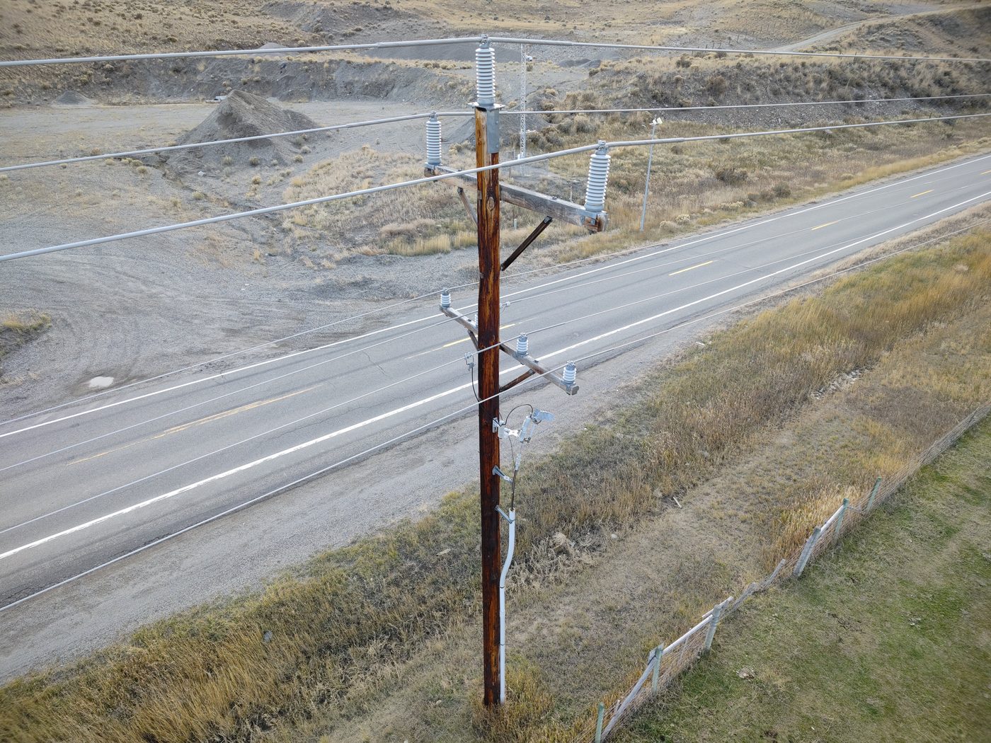
An image record that can be assessed: hardware, insulators, and arresters resolved well enough to judge, on a structure the record can name. From Detect's utility inspection photo records.
The image record. Sharpness and effective resolution decide how much of the defect catalog a frame can be judged against. On Detect's 258-type, 19-class transmission catalog, sharp capture keeps 100% assessable, soft capture 69%, blurry capture 7% (Detect Data Quality Program, 2026). The fastener- and splice-level defects that end in faults sit in the top tier - the first to vanish when capture slips. The physics behind that ceiling, down to ground sample distance, is the subject of why AI inspections miss defects.
The location record. Every image has to be verified to its structure, not trusted to its GPS tag. Auto-tagging fails exactly where transmission assets live - parallel circuits, tight corridors, structures a rotor-diameter apart - which is why association is the single largest cause of rework. Verified association uses what is in the frame, not only where the drone thought it was.
The asset record. One record per structure, carrying every cycle's imagery from consistent positions, in one defect taxonomy. This is the record that turns an inspection into a condition history - and the record that visual predictive maintenance runs on. It is also where the systems question begins: the four data agreements that let that record flow into your EAM and GIS are the Asset-Record Contract.
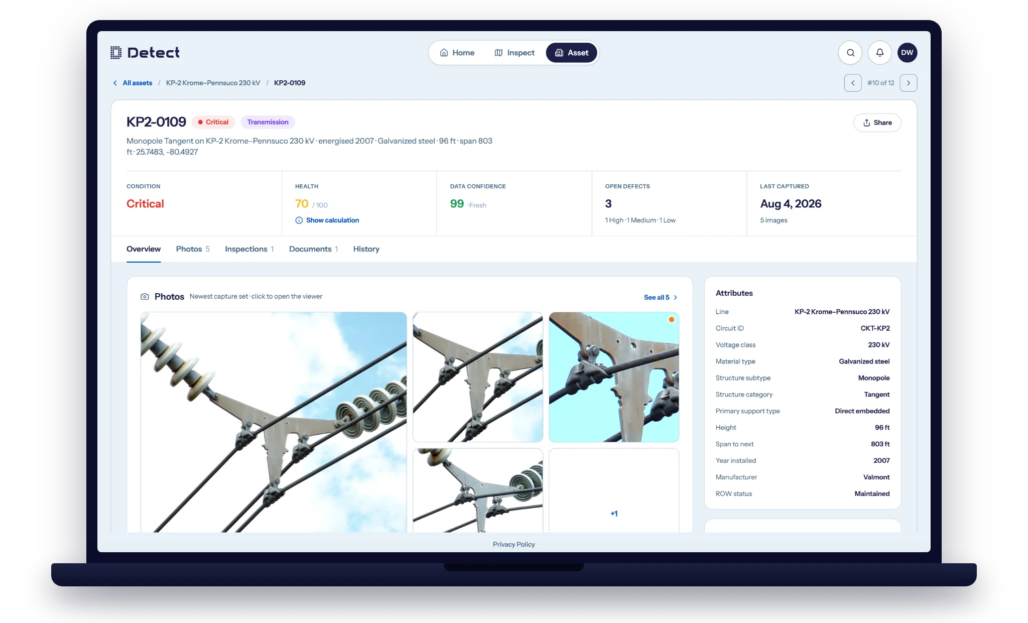
The asset record: one structure, its condition and health score, and a data-confidence figure that says how much of the record the imagery can actually support. Shown in DetectOS.
What is the Decision-Grade Photo Standard?
The Decision-Grade Photo Standard is a set of five clauses a utility writes into every inspection contract, so photo data quality is specified and accepted like any other deliverable - not hoped for. Most inspection specifications define what to fly. Almost none define what the photos must be able to prove.
01 · Coverage. A shot sheet per structure type, derived from the defect catalog: every required shot maps to a defect class, and no catalog item is left without coverage. Steel lattice, H-frame, and wood pole each get their own sheet, tuned to where the components actually are.
02 · Resolution. An assessability floor per component class, not a single megapixel number. The floor is set by the smallest defect you need to see on that component - a cotter key demands more pixels than a cross-arm.
03 · Association. Image-to-structure links verified from the frame, with GPS treated as a hint. The contract states the acceptable association error rate and who measures it.
04 · Continuity. Capture positions and angles repeat cycle over cycle, so the structure's record trends instead of resets. A shot sheet delivers this for free; improvised flights never do.
05 · Acceptance. Every frame is graded at ingest, before analysis. Out-of-standard capture is flagged for re-fly while the crew is still in the area, and the rejection rate is reported as a number, campaign by campaign. Contractors delivering to a published standard typically bring rework from the 15-25% range down to 3-7% within two campaigns (State of Utility Drone Inspections, 2026).
Work backwards. Start from the defect classes that drive your outage history, ask what each one needs to be visible, and let those answers write the shot sheet, the resolution floor, and the acceptance rule. A standard built forward from "what can the drone do" produces pictures. One built backward from "what must the record prove" produces data.
How does the Data Quality Program make photo data decision-grade?
By putting a quality layer between the inspections you already pay for and the decisions you make from them - on any sensor, from any crew. You define the scope and act on the findings. Four things happen to your imagery in between, before a single defect reaches your desk.
Calibrate. Your standards and your defect taxonomy are mapped before capture begins - EPRI-style inspection criteria, your own spec, your own problem codes. Inherited, not reinvented, so what comes back is accepted rather than reflown.
Standardize. Shot sheets fix every required angle and setting per structure type. A defect catalog becomes a per-structure shot sheet, and the shot sheet becomes the capture sequence - the same plan every flight, whether your crew or a contractor is flying it.
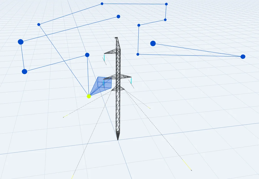
The shot sheet, executed: capture positions computed per structure type, so coverage does not depend on who is flying.
Grade. Every frame is scored for sharpness and effective resolution before any defect model runs. Analysis proceeds on what is assessable; the rest is flagged by exception instead of buried. Each verdict carries a quantified, reviewable basis, so quality is measured rather than eyeballed.
Validate. Computer-vision findings are confirmed by trained reviewers and severity-scored. This is the Hybrid AI + Expert Review model in practice: the AI carries the volume and a person stands behind every finding. The output is a defect tied to the right structure, component, and risk score - comparable across crews and over time.
The same program has a pilot-facing side. Any drone service provider or in-house crew can qualify through the free drone pilot training for utility inspection, flying pre-built shot sheets against the same review standard Detect's own campaigns use. That is what makes the vendor-agnostic promise real. You keep the crews you have. They fly to a standard you can audit.
What does good photo data change in the field?
It changes what a program can see, and when. Three campaigns, three different consequences of getting the record right.
Risk clusters - and clusters predict. On a new 345kV transmission line, a six-month construction-QA program produced 45,335 findings across 927 structures from 65,701 images. Of the 67 critical defects, 51 - 76% - sat on a single segment that held 69% of the structures, and within it a single 63-structure stretch accounted for nearly every missing corona ring on the project. That concentration was only visible because every finding was tied to a verified structure in one taxonomy; it pointed the warranty remediation at the right contractor and the right miles. The full account is in the 345kV construction QA case study.
A record that moves a capital decision. On two wooden H-frame lines, a three-person crew captured 100% of 96 structures in one field day. The reviewed record flagged 55 high-risk conditions - 35 on one line, 20 on the other: rotten poles, loose hardware, splitting cross-arms. The evidence funded a replacement program that had stalled without it.
The season that mattered. On a newly commissioned ~250-mile HVDC intertie of roughly 2,600 lattice towers, a 30-day campaign put about 122,000 images through the quality layer with a three-person team. It flagged 1,270 for review. One validated finding - a clevis bolt backed off, its cotter key missing, high in a suspension assembly - became a repair cleared in 120 minutes of field time, in the line's first season after commissioning. The line had been commissioned in spring; the defect would have taken it down in winter. The averted forced outage was worth more than $1M in revenue (Detect Data Quality Program asset-owner report).
The common thread is not the model. It is that in each case the photos were data: assessable, placed, and comparable - so the finding could be trusted, prioritized, and defended. That last word matters more every year. The same image-linked, severity-scored record that ranks your risk spend is the record that stands behind a wildfire mitigation plan filing, a risk-spend-efficiency case, or an underwriter's renewal questions.
How do you measure utility photo data quality?
With five numbers, reported per campaign, that make visual data analysis accountable before anyone argues about model accuracy:
| Metric | What it tells you | Where the problem usually sits |
|---|---|---|
| Assessable share | Percent of frames that clear the sharpness and resolution floor for their component class | Capture settings, stand-off distance, weather calls |
| Coverage vs. shot sheet | Percent of required shots delivered per structure | Improvised flights, missing angles |
| Association error rate | Percent of images filed to the wrong structure before verification | GPS-only tagging in dense corridors |
| Rejection / rework rate | Percent of delivered imagery sent back or re-flown | The composite of the three above - 15-25% is typical on ad-hoc programs |
| Capture-to-action lag | Days from flight to a work order a planner can act on | Manual review queues, PDF handoffs |
The first three are inputs; the last two are outcomes. A program that only tracks outcomes learns that something went wrong after the crew has gone home. A program that tracks the inputs at ingest learns while a re-fly still costs an hour instead of a mobilization.
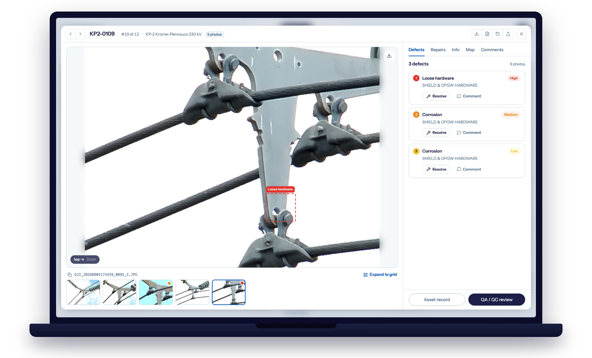
What a measured, reviewed finding looks like: the frame, the severity, and the expert QA/QC decision on one structure. Shown in DetectOS.
How should an asset manager start?
With a measurement, not a procurement. Find out what share of last season's imagery is decision-grade before you change anything - the number usually settles the budget conversation on its own.
- Measure the assessable share of last season's imagery. Grade a representative section against the catalog you actually use. The gap between what you paid for and what you can act on is the business case.
- Write the Decision-Grade Photo Standard into the next contract. Coverage, resolution, association, continuity, acceptance - five clauses, each with a number and an owner.
- Calibrate before capture. Map your defect taxonomy and inspection criteria to the shot sheets so deliverables are accepted on the first pass.
- Grade at ingest and re-fly while it is cheap. Flag out-of-standard frames while the crew is still in the area, not in the analysis queue weeks later.
- Trend the record, not the report. Keep one asset record per structure, in one taxonomy, from consistent positions - and let prediction run on that.
The bottom line
Predictive maintenance for utility grid assets is a data quality problem before it is a modeling problem. About 40% of inspection imagery cannot carry a decision, roughly half of rework traces to the data, and the record that would let you see a failure coming is the one most programs never build. Fix the three records - assessable images, verified locations, continuous asset histories - specify them in the contract, and the prediction follows.
That is what the Data Quality Program is for: the quality layer beneath the inspections you already run, on the sensors and crews you already use. The photos you pay for become the evidence you act on and defend.
See how much of your imagery is decision-grade
Send us a representative slice of your network. Detect will grade it against a 258-type catalog, show what share is assessable, and surface the defects, severities, and risk ranking your current process is missing - on your own structures.
Book a free audit →